Everly Website
UX redesign for an online wedding planner
Duration
3 Weeks
Role
UX Researcher
Tools
Adobe XD
Illustrator
Photoshop
Goal
Everly is a relatively new business, and they wanted to redesign their website to increase sign ups.
Problem
Couples shopping for services and vendors at the beginning of their planning journey don’t have time nor the desire to do a deep dive into comparing and contrasting options. Potential customers coming to the Everly site have expressed confusion over what services they offer, they can’t find examples of their past clients, and there’s an overload of information causing them to turn away and not sign up for the free offerings intended to hook them into using the product. They simply want to peruse different websites for price, style, and brief summary of offerings.
Hypothesis
By simplifying the most frequented pages couples visit when shopping for wedding services, making the free offerings more visible, and incorporating Pinterest into the easier to find portfolio gallery, we will increase potential customer’s interest in learning more about Everly. We will see this by seeing an increase in users signing up for the free introductory phone call and downloading the day of sample pack.
“weddings are a uniquely tricky business — not because of bridezillas or the involvement of government and God, but because every marketing dollar you spend acquiring a customer has to be spent again the following year.”
– Kaitlyn Tiffany, Vox.com: Why is the wedding industry so hard to disrupt?
Research
Everly is an online wedding planning service currently serving the Pacific Northwest that utilizes video chat and online forms to reduce the time and cost of your traditional wedding process. They hope to eventually bring their wedding planning format to the national level.
For the research on this project, there were 3 points I needed to investigate:
- Couples in the market for a wedding planner
- Wedding Planning Industry
- Wedding Tech Industry
In order to collect information and data on these areas I used an online Google survey, interviews with couples in various stages of the wedding process, and interviews with Subject Matter Experts who also happen to have gone through the wedding process.
28 Survey Responses from Married Couples
3 Couples in Various Stages of Wedding Process

2 Subject Matter Experts
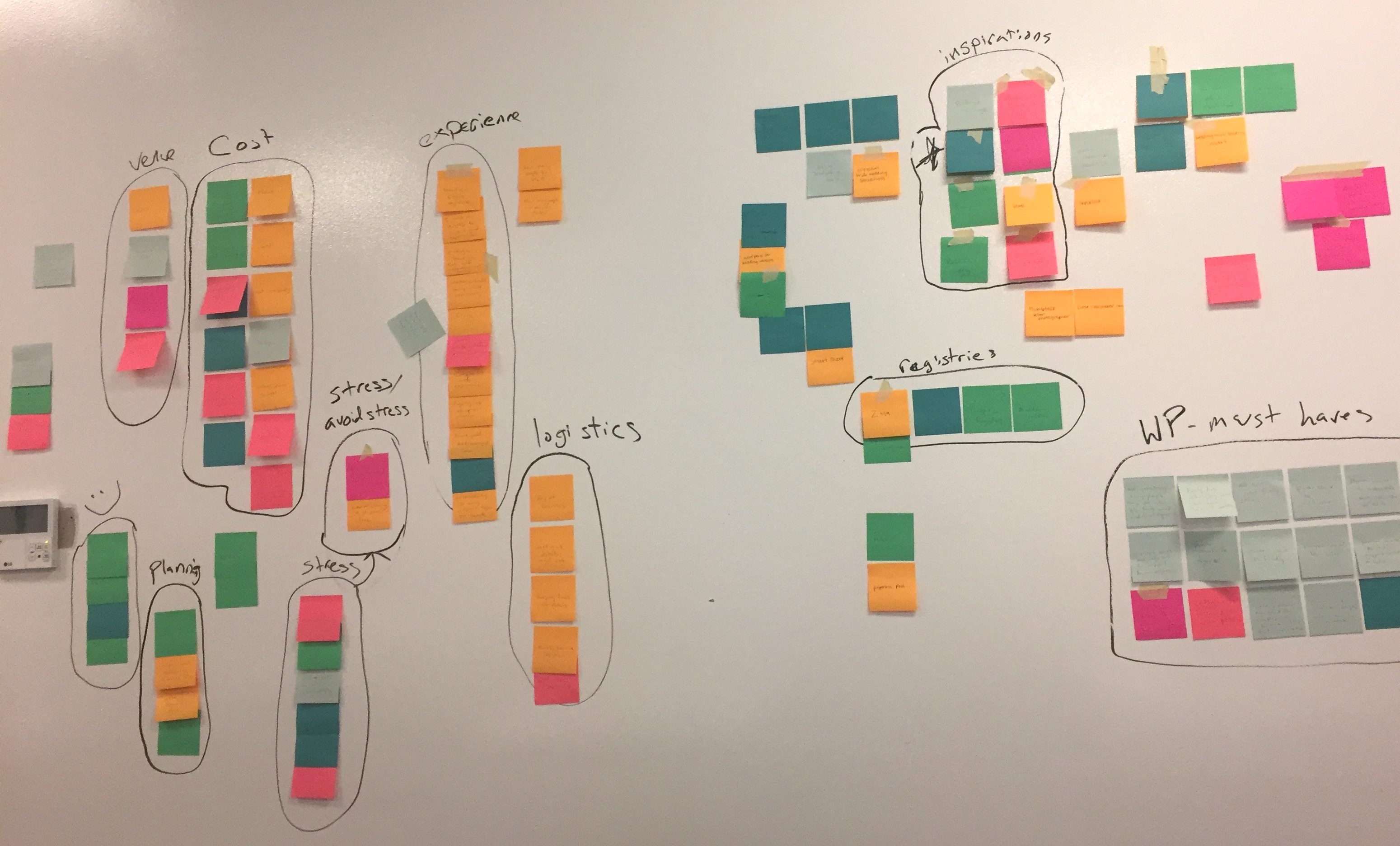
Affinity Diagram
There was a pile of data from the survey and interviews. I wrote out all of the soundbites onto sticky notes and performed an Affinity Diagram exercise to find themes and key ideas. Once I identified these themes, I broke down my data to find quotes and metrics to support our ideas moving forward.
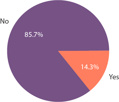
Couples that used a wedding planner
Weddingwire Annual Survey
Top Vendor Search Criteria
- Price
- Online Reviews
- Photos
- Availability
- Inquiry Responsiveness
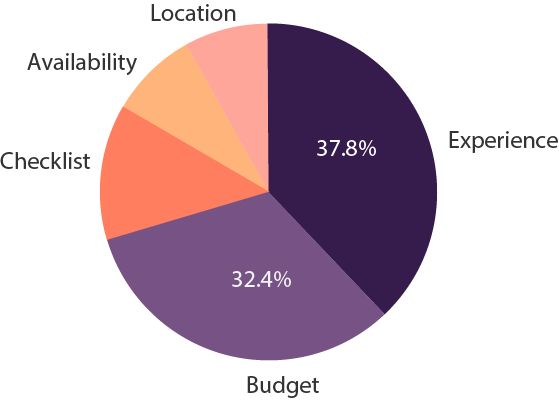
Initial concerns in the wedding planning process
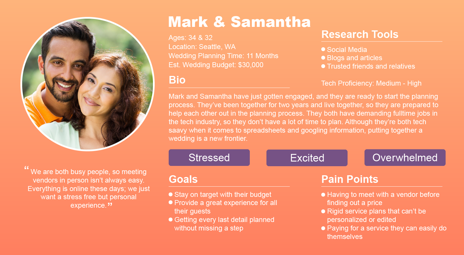
Persona
The Research was great for finding demographic information to build a Persona. The Affinity Diagram helped to determine underlying motivations, goals, and pain points. The most interesting part of this project was learning our challenge was to design around a user who was overwhelmed and excited.
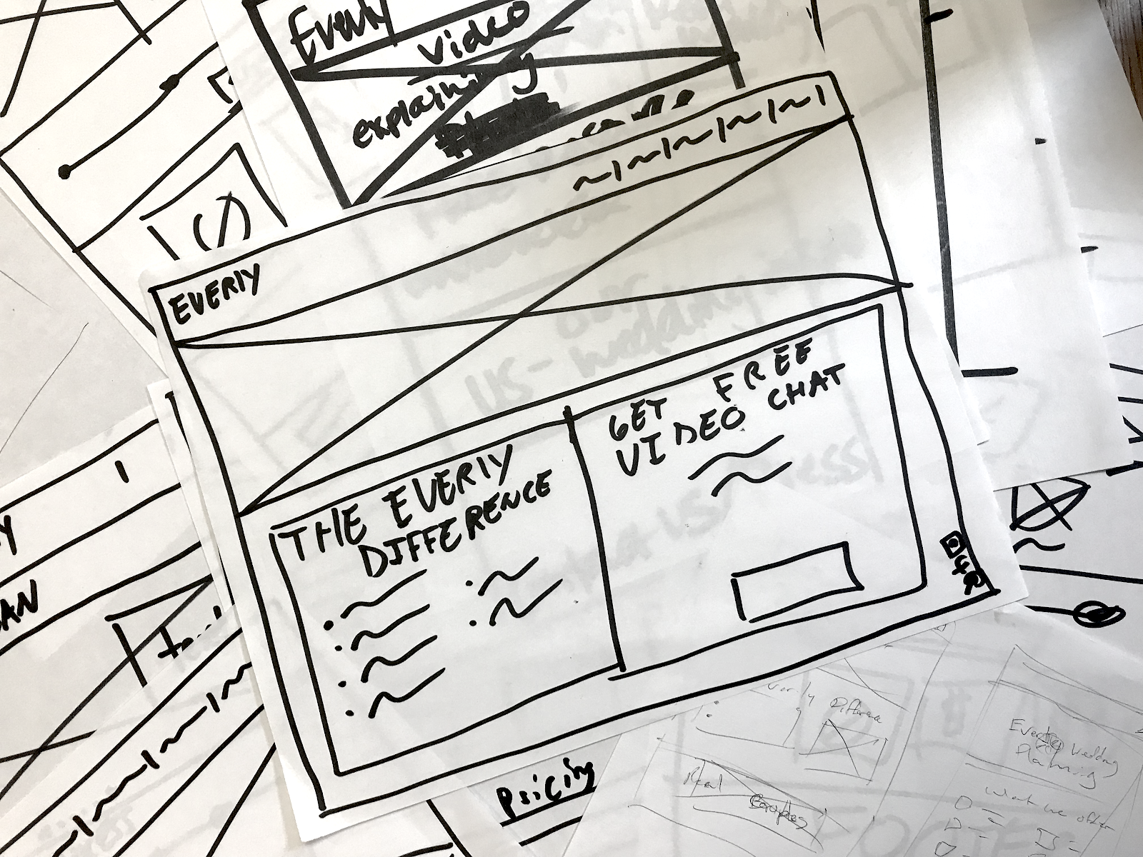
Design Studio > Wireframes
After completing our research our team got together to do a Design Studio exercise, which resulted in a mock-up of our Homepage. Our Interaction Designer turned our final sketch into wireframes.
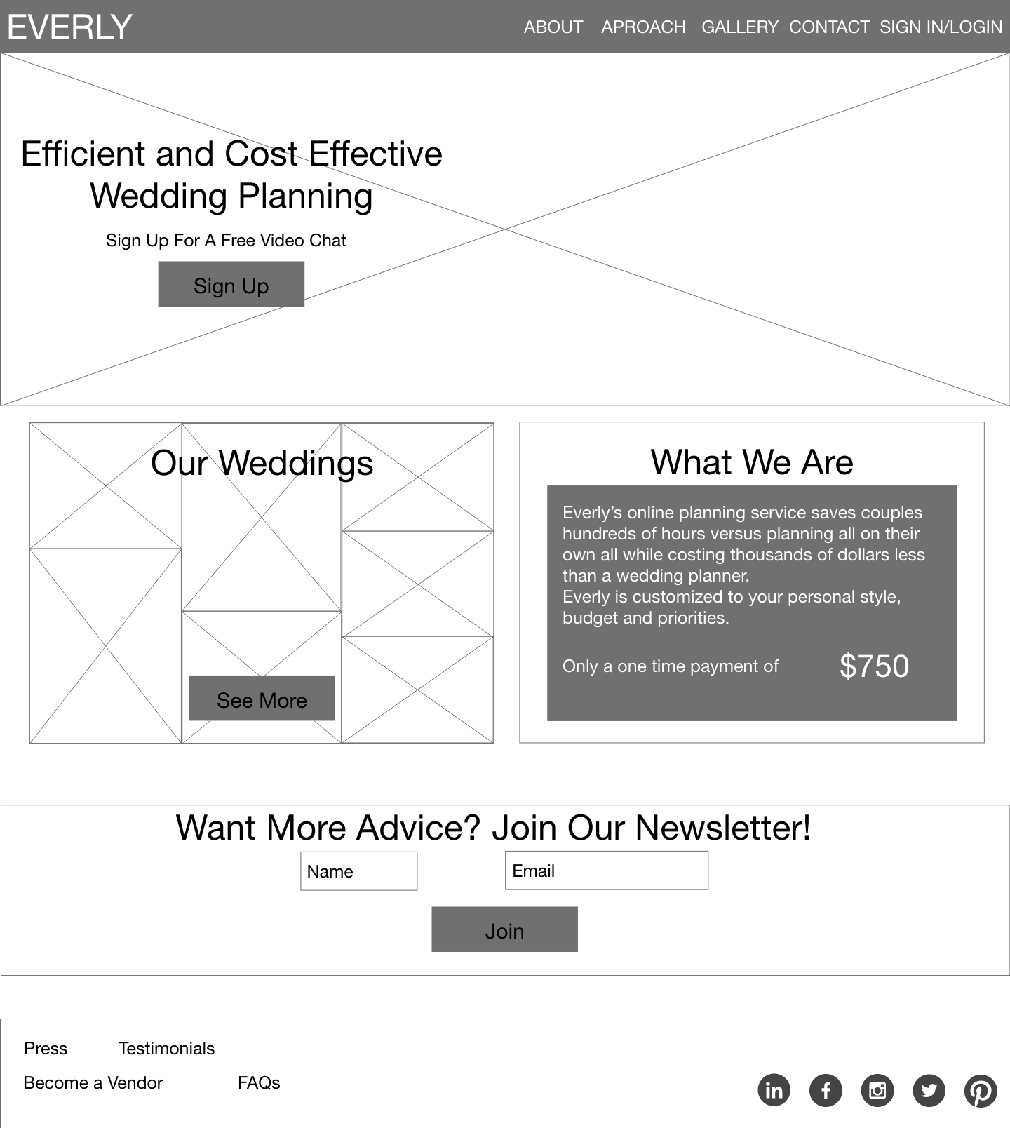
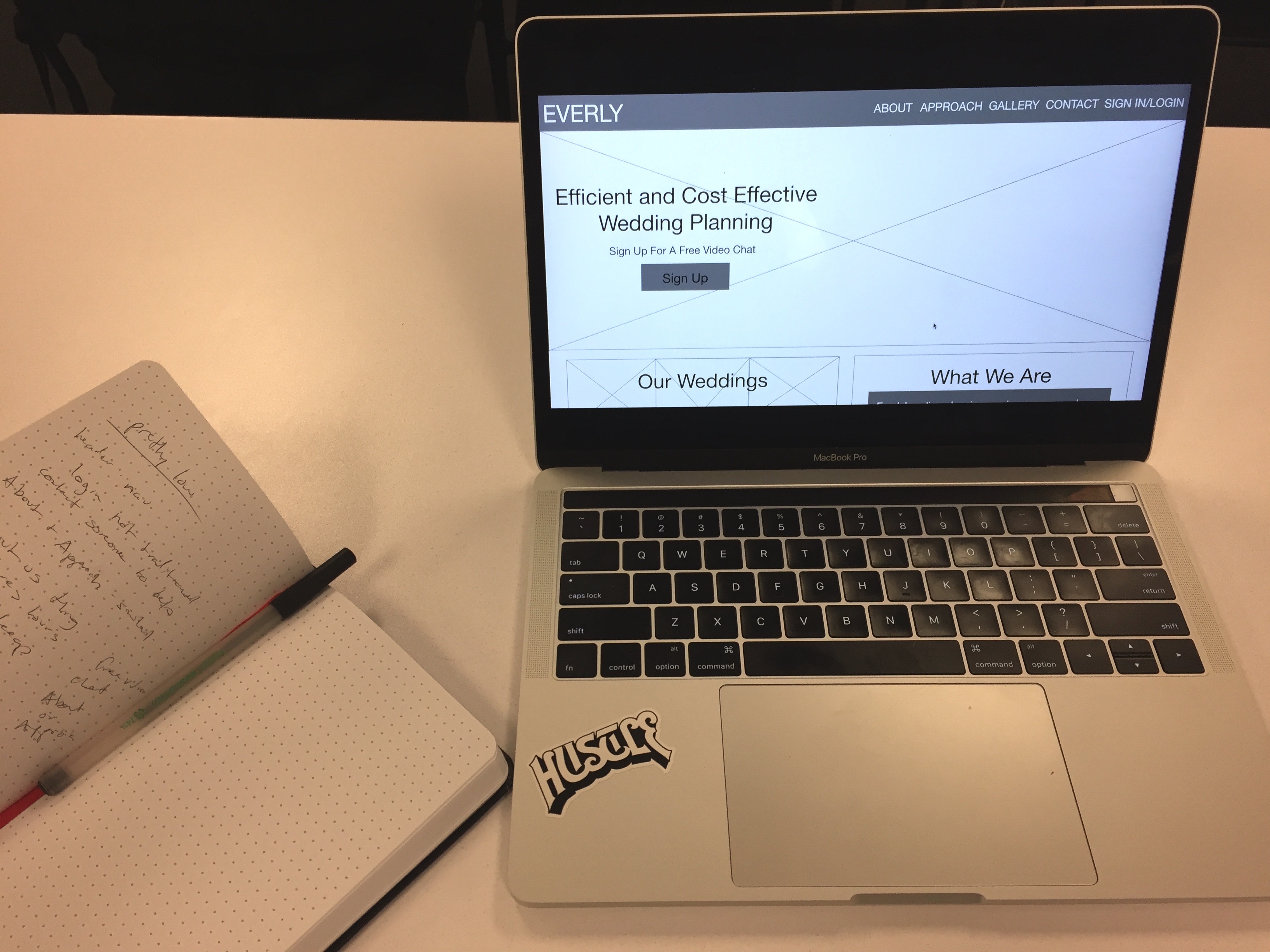
User Testing
The Interaction Designer created a series of wireframes in XD and created an Interactive Prototype based on 3 user scenarios we came up with to test the functionality and intuitiveness of the site. I oversaw 5 users with little to no wedding planning knowledge try to work through the 3 tasks.
- Finding the ‘Free Video Chat’ offer on the homepage (all of the most successful wedding tech businesses offer free tools to entice people to sign up for paid services)
- Finding the Everly gallery page and ‘Pinning’ a photo to Pinterest (our research showed Pinterest to be the most used tool for wedding planning and a great way to increase marketing reach)
- Accurately describe the Everly process from the ‘Approach’ page
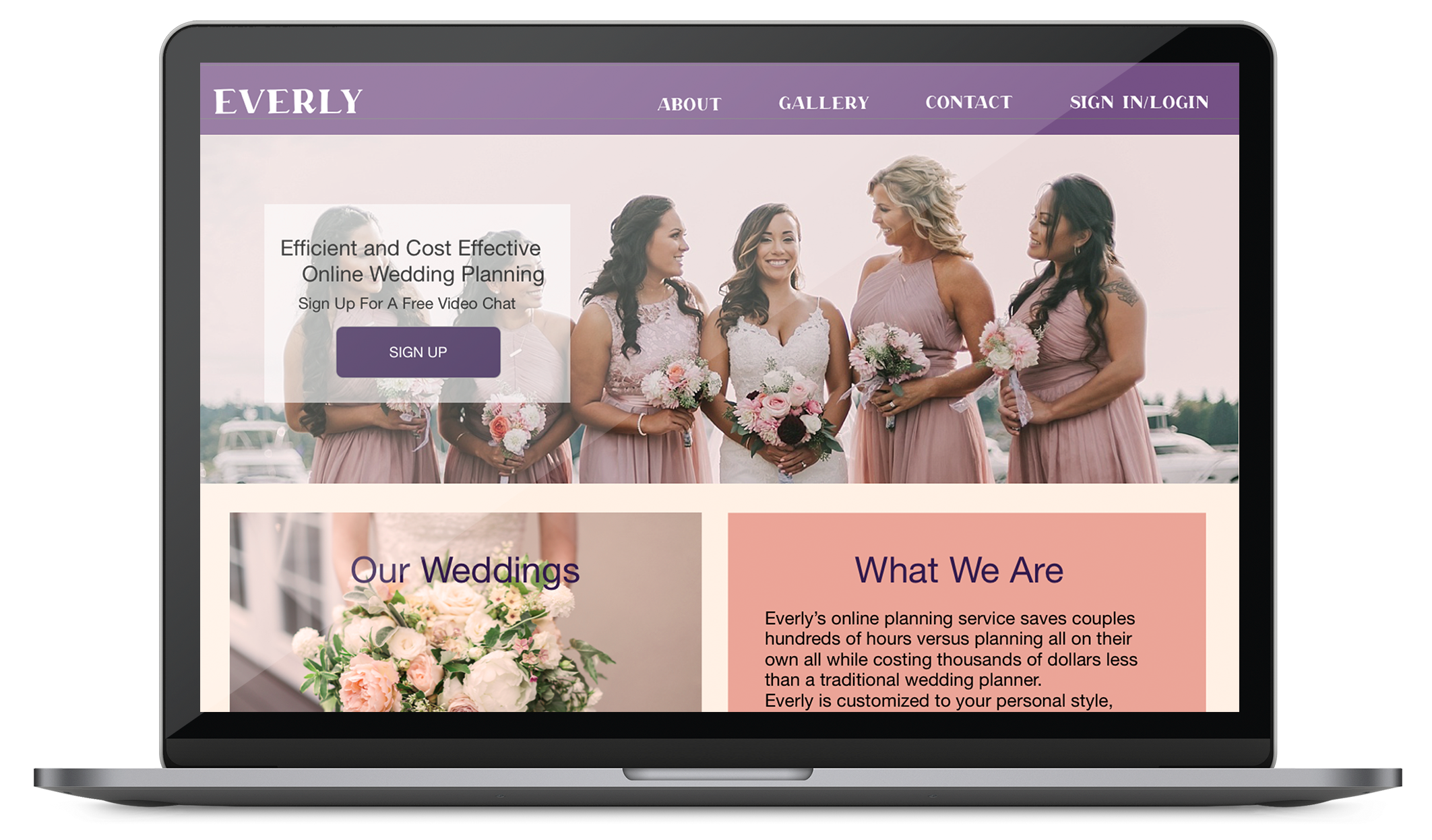
Wireframe Edits > High Fidelity Mockup
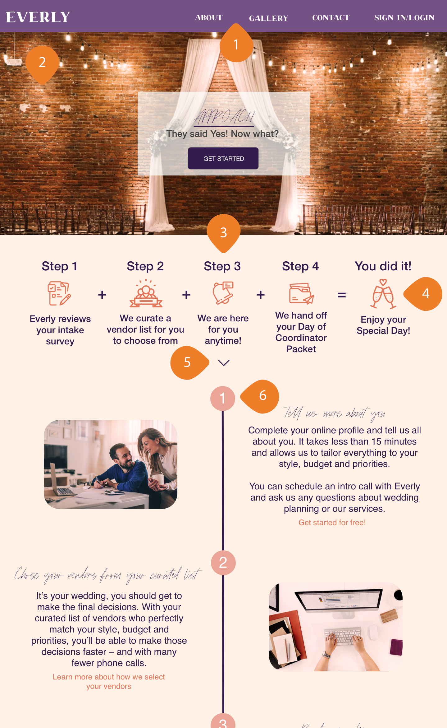
1. The wireframe navigation consisted of About, Approach, Gallery, Contact, and Sign In/Login. Testing showed the ‘Approach’ was confusing alongside ‘About’, so we moved ‘Approach’ under ‘About’
2. The color palette was provided by Everly. I taught our Visual Designer, Isa, how to apply a color filter over photos in Photoshop so that they are more representative of the brand instead of scouring for just the right photo. I also made sure we used high quality photos since couples often rely on photos when choosing between vendors.
3. The original steps on the Everly site confuse potential users, and no one in my testing group could accurately describe the process from the original description. Noah and I worked together to come up with a clearer description by shifting the point of view to Everly versus what the client will be doing during the process.
4. The icon package dowloaded by the Visual Designer didn’t include a gender neutral ‘Wedding Day’ icon, so I created one to match the style.

5. Testers didn’t know the page was scrollable because the web fold fell just bellow the icon descriptions, so we added an arrow.
6. There were too many steps in the original process, especially for users who are already feeling overwhelmed, so Noah and I worked together to limit the number of steps without loosing the content.
Scrolling Homepage
Scrolling Approach Page
Lessons Learned
This was my first time working in a research role for a digital design project. It reminded me a lot of my work as a prop builder and theatrical design assistant hunting down facts and figures for materials and design accuracy. The greatest hurdle was the time limit because I had a narrow window to schedule interviews in order to keep the project moving forward. I also had to learn Adobe XD last minute, which turned out to be pretty intuitive due to my understanding of similar products.
My teammates didn’t have as much experience working with clients in a design setting as I do, so it provided a great opportunity for me to teach some of the skills I have picked up along the away including working with Photoshop, managing client expectations, and branding. It was a lot of pressure to collect so much user research in a short amount of time to back up our design desissions, but in the end our client was happy with the results and will continue working with my teammates.