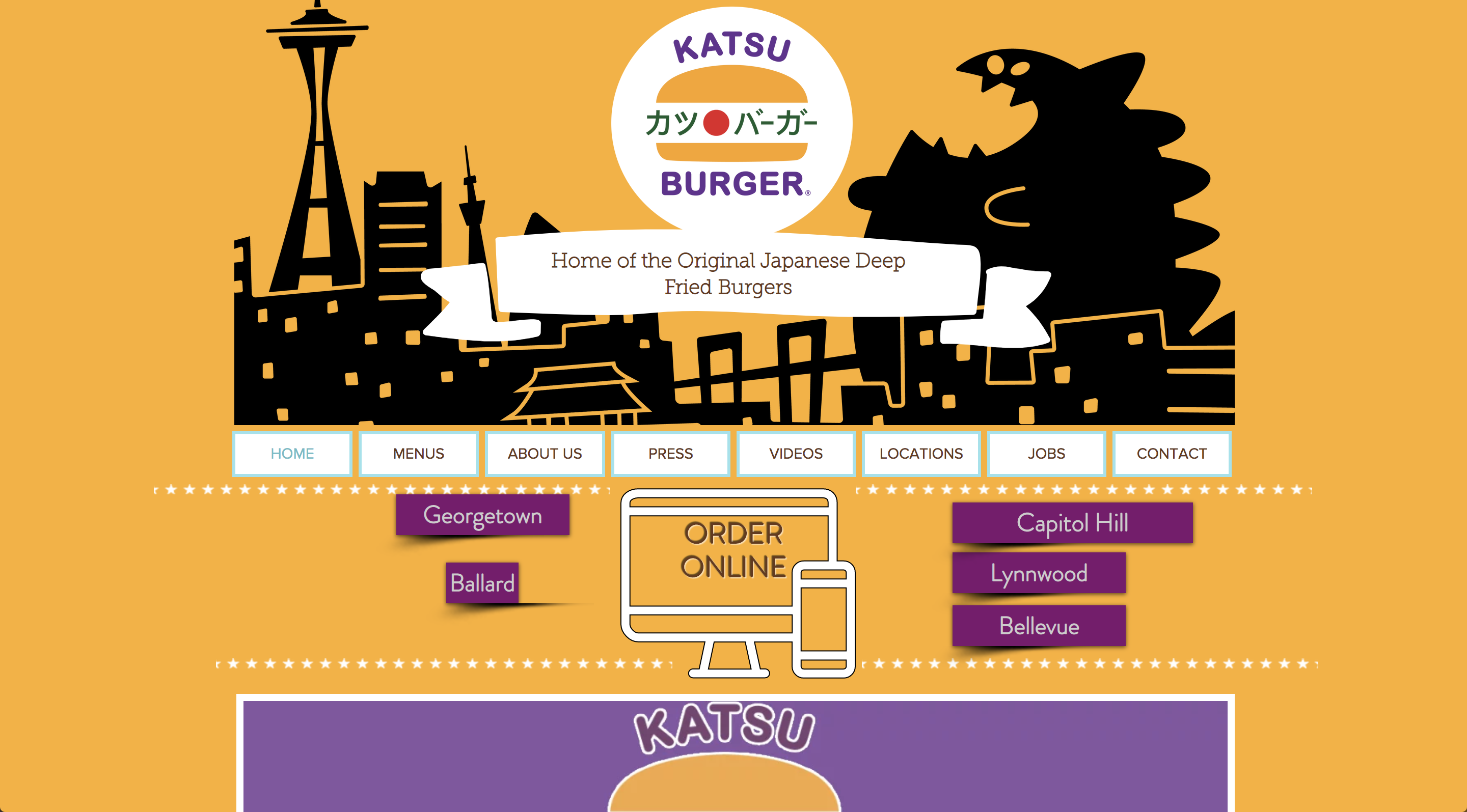
Katsu Burger
Case study at GA exploring a UX solution for an existing website.

Duration
2 Weeks
Role
Project Manager
Interaction Designer
Visual Designer
GA Student
Tools
Sketch
InVision
Photoshop
Illustrator
Goal
Re-design an existing company website centered around a specific users needs and goals.
Problem
New customers are bombarded with too much information on the Katsu Burger website. They want to make an informed decision before putting their money into the Katsu brand, but they’re turned away by the clutter of images and confusing navigation on just the Homepage.
Hypothesis
By reducing the number of photos, simplifying the navigation, and cutting out the decorative fluff, users will be able to find the information they’re looking for much more easily. The intuitive organization and clean design will entice them to try out Katsu Burger and/or make online purchases causing an uptick in sales.
“Restaurant owners understand the importance of atmosphere in their physical location: having clean tables, nice lighting, and a welcoming atmosphere. The website is no different.”
-Brent Hartmann, Bitcookie
Competitor Analysis
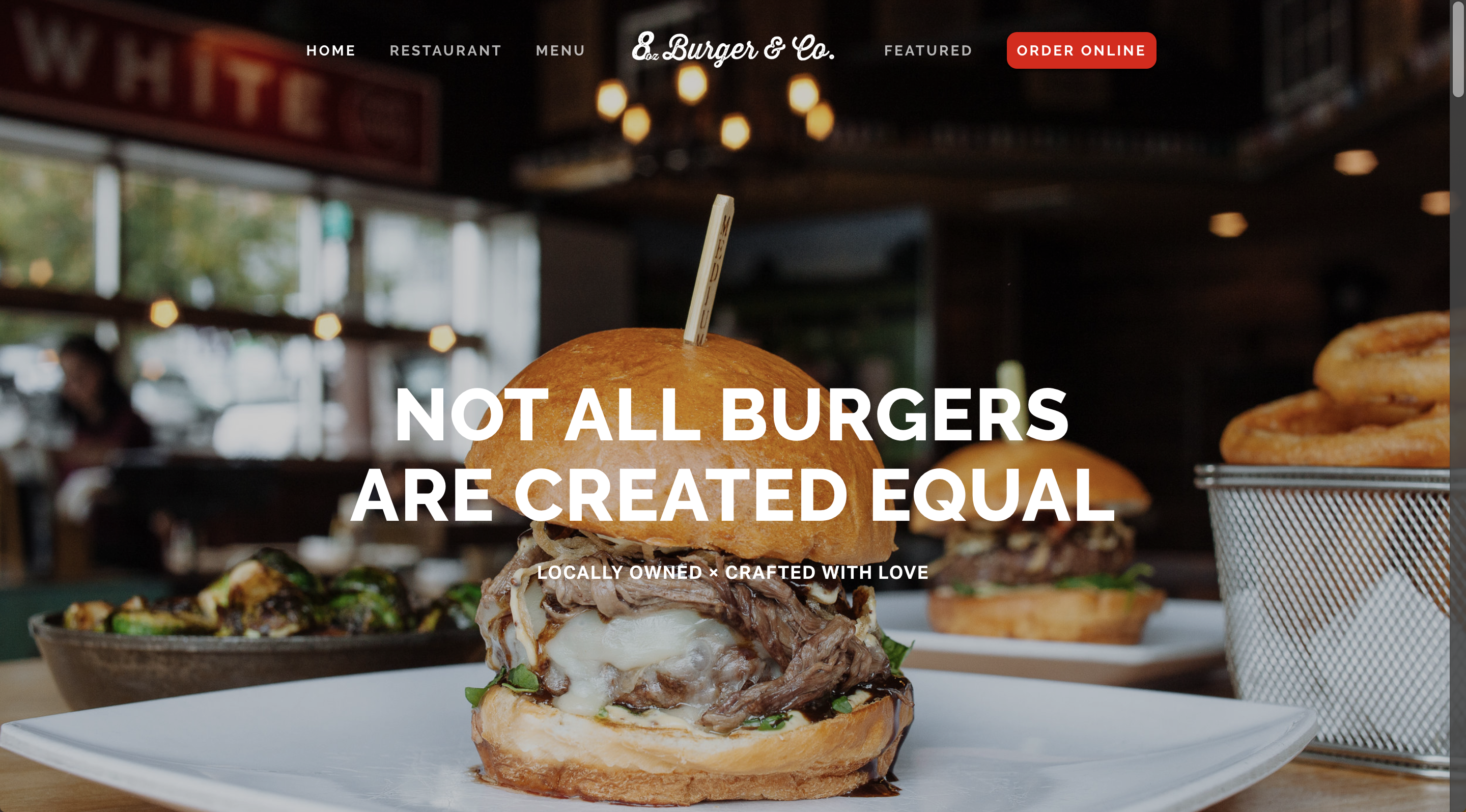
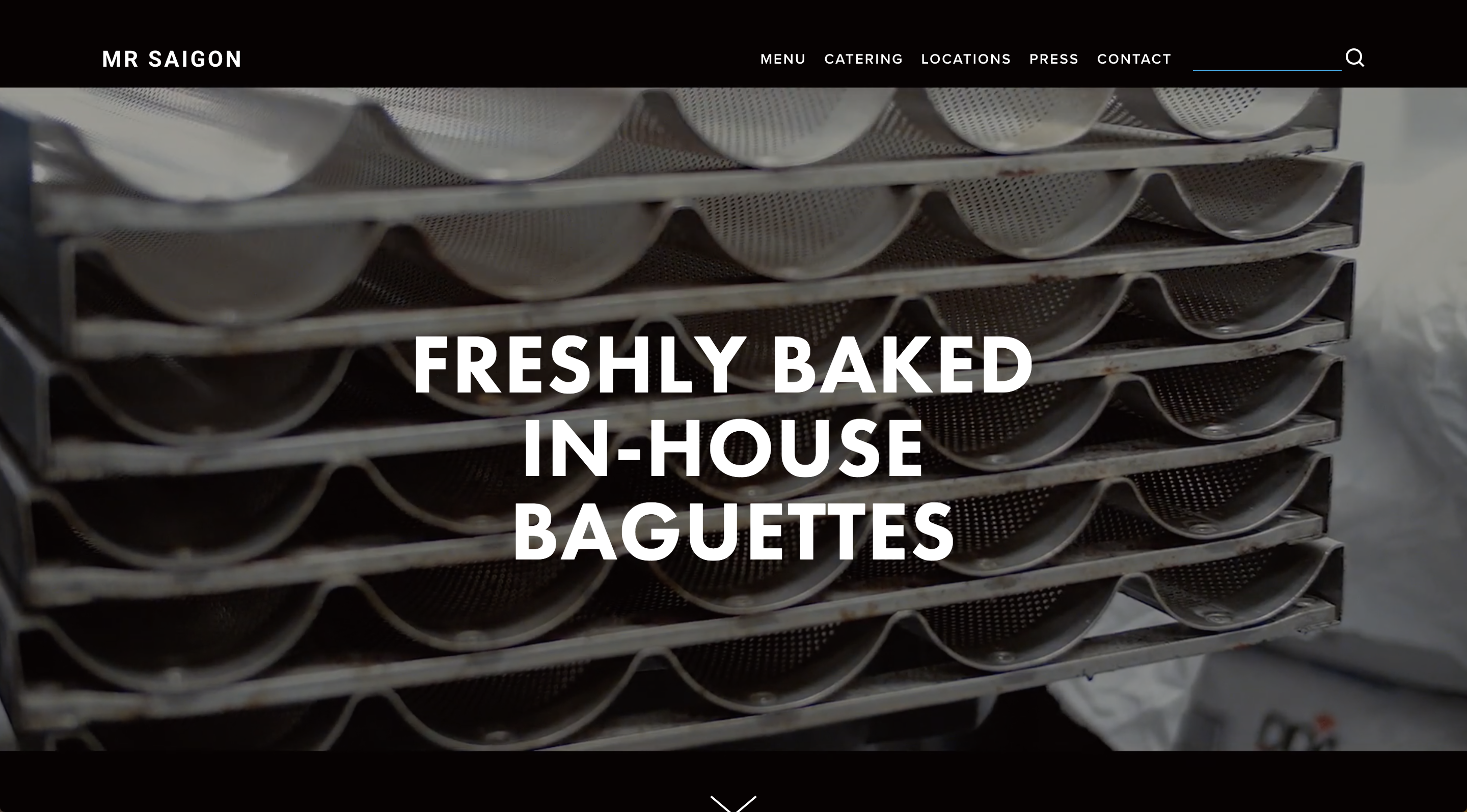
My first step in the Katsu Burger re-design was to conduct a Competitor Analysis. I broke down the business into its product components. It markets itself as a burger joint, fast food, Asian fusion, Japanese, and youthful. There’s no place that checks all of the same boxes, so I looked at 8 Oz. Burger, a local burger chain that specializes in exotic meats and flavors, and Mr Saigon, a brand new hip bakery chain combining traditional Vietnamese food with a European style cafe. I was able to identify common design elements and best practices backed up by articles about restaurant website building and the psychology of food menus.
Persona
John Goodson
Bio: 38-year-old art teacher and single parent of a 12-year-old girl. He struggles to find the right activities for her as her interests change regularly, and he tends to steer her toward the things that he can also take part in.
Wants: Quick access to a range of options, a feeling of a relationship with the brand, social proof from others to know what’s cool
Pain Points: Difficult navigation, lack of trust with unfamiliar retailers, lack of sufficient product description

User Flow
In order to determine a User Flow, I came up with 3 scenarios that would bring joy to my user, John. These tasks involved getting to the menu page, signing up for the newsletter, and making a purchase off of the Merchandise Page. I wrote out the tasks as tiny short stories and these helped me figure out the simplest path to develop the sitemaps.
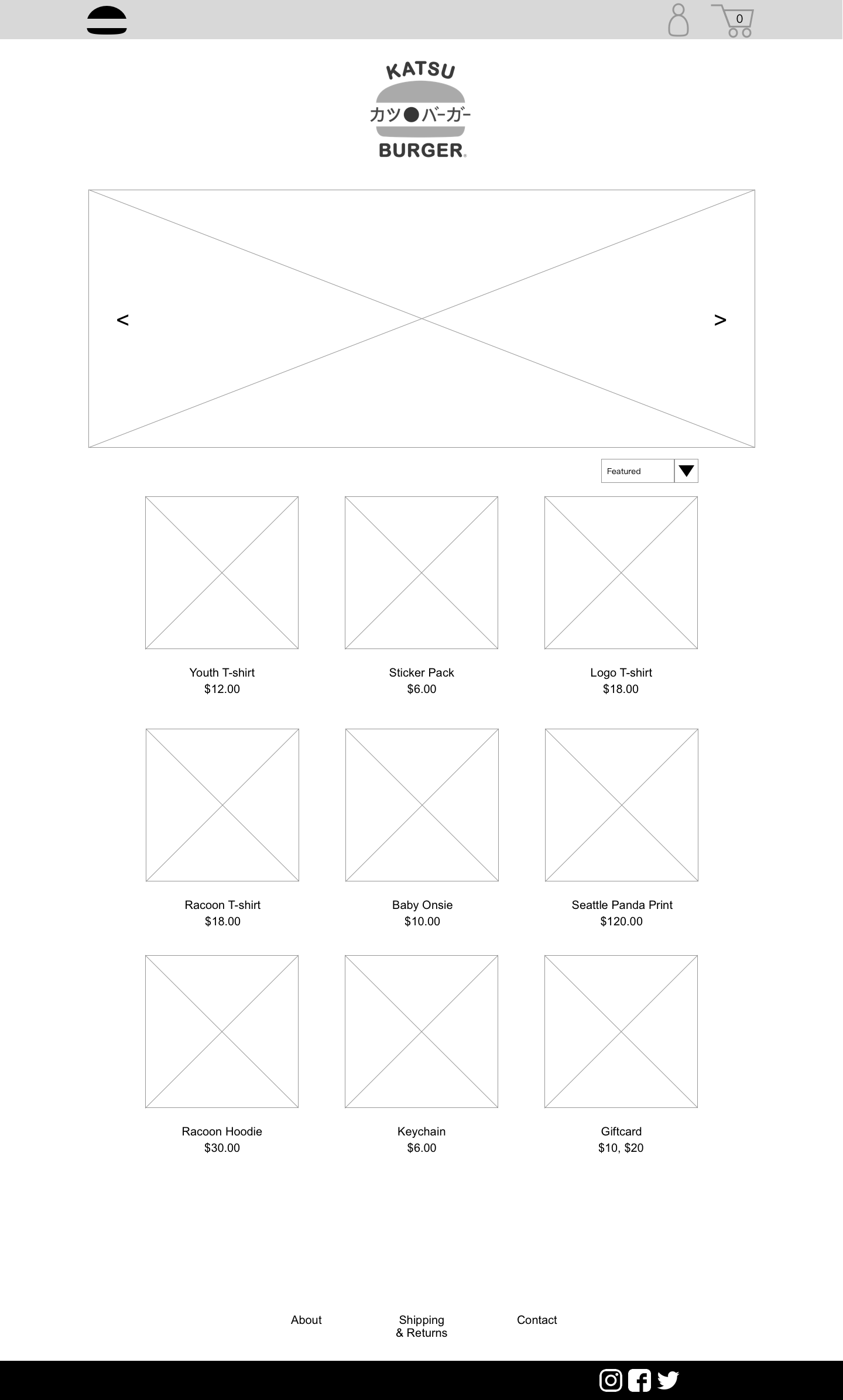
In my research I found the best practice for adding a merchandise page is to have a seperate URL so that features such as ‘Sign In’ and ‘Cart’ don’t distract from the primary functions of the site.
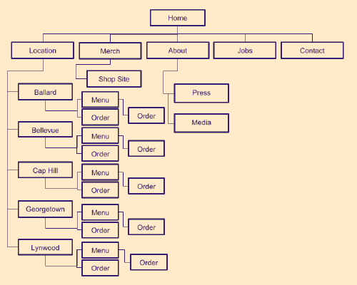
Main Sitemap
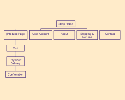
Merchandise Sitemap
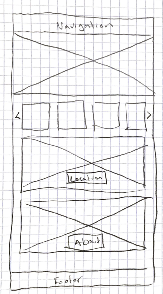
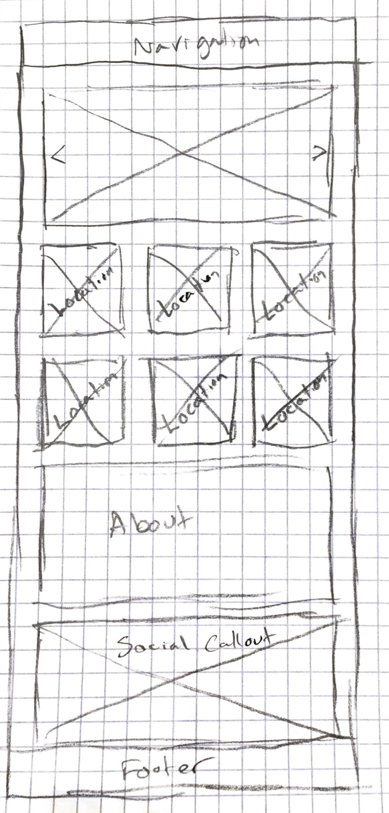
Homepage Concept Sketches
I sketched out various Homepage layouts to get a visual idea of what would be the most intuitive in helping the user complete their tasks and looked the most appealing.
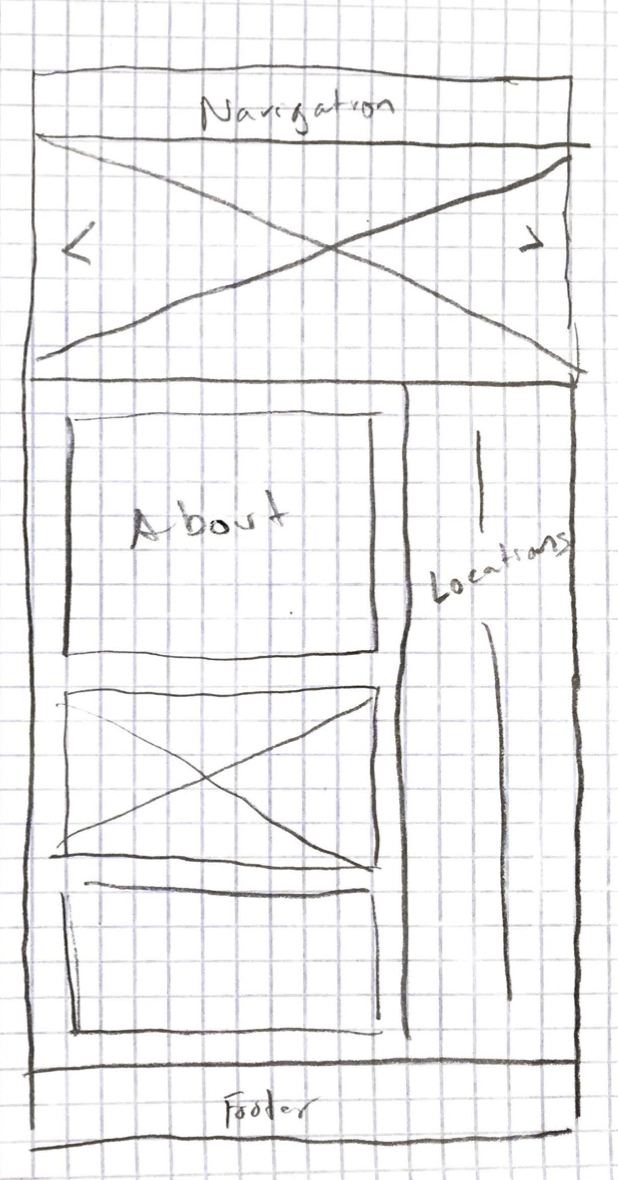
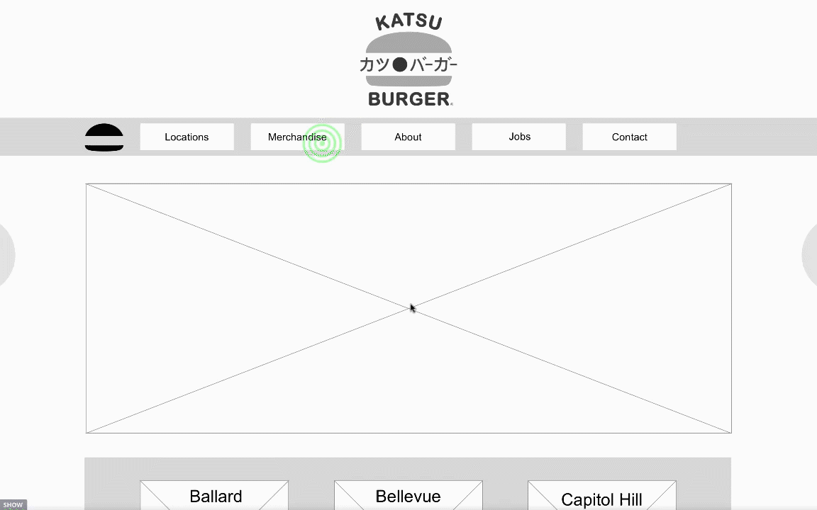
Wireframing
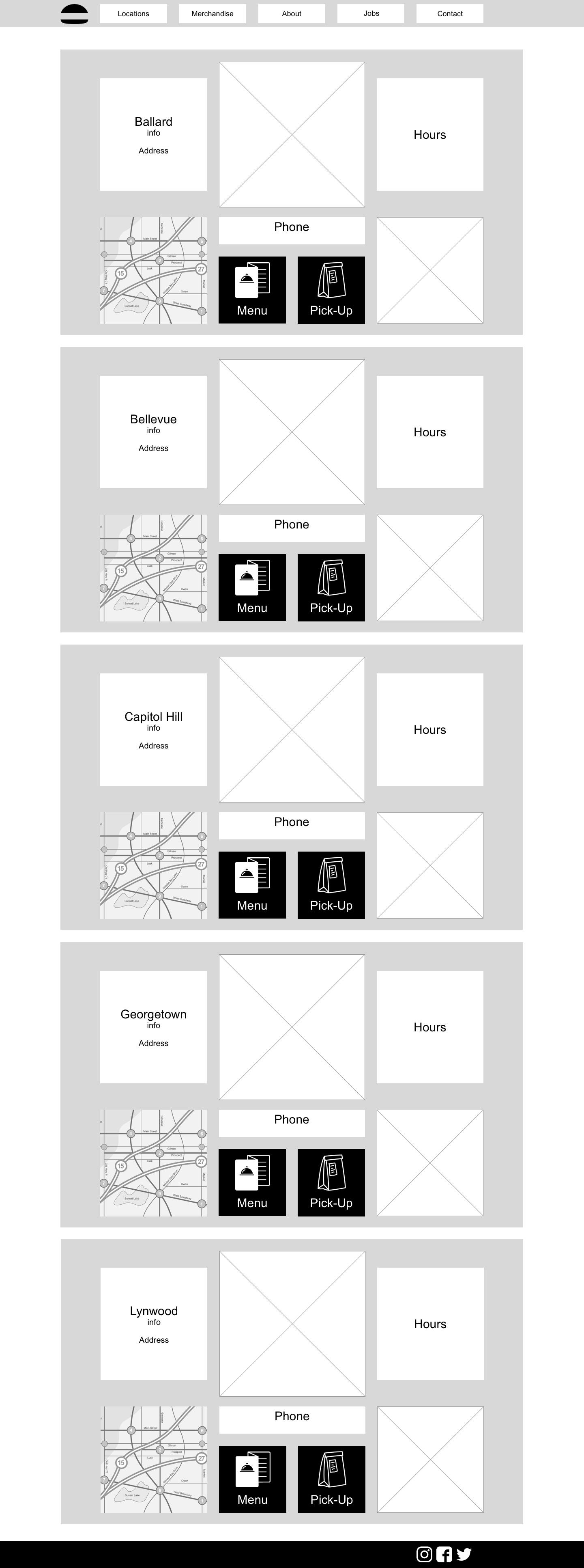
After deciding on a Homepage I turned to Sketch to put together wireframes of the 4 primary pages for my user scenarios. I designed the Homepage, Location Page, Georgetown Menu Page, and the Merchandise Page. I also wireframed all overlay menus and drop downs associated with the tasks to create a prototype.
Prototype
I used InVision to build a functioning prototype for User Testing. I filmed interaction with Camtasia during the User Testing to record feedback from the users. The example to the left is the ‘Making a Merchandise Purchase’ scenario.
User Testing
After completing the wireframes and turning them into an Interactive Prototype, I tested the prototype with 3 users. They had 3 different tasks to complete, and they accomplished all of them with relative ease. The only issue I observed was more of an oversight. Originally, I thought all the locations would be on one page, and then the user would click on a specific location to get to the Specific Location Page. However, I realized during wireframe that my user would want to get to the Specific Location Page with the fewest amount of steps, thus skipping over the All Locations Page.
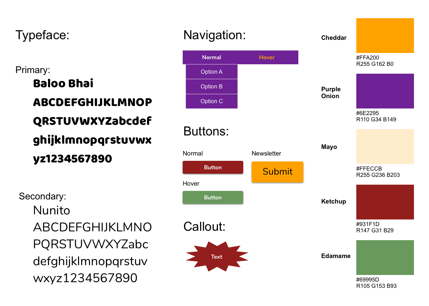
Style Guide
I used the Katsu Burger logo for the Cheddar and Purple Onion color, but the rest of the colors in the logo were far too saturated for easy readability. Mayo is simply Cheddar dialed down on the saturation level. I played with the tone of the green and red to develop Ketchup and Edamame. I checked the contrast of the white text against the Purple Onion, and it got the AAA approval. The only contrast issue was the Cheddar on Purple Onion, which only reached the AA rating, but since it’s just for the hover function, it’s a stylistic choice I can live with. The typefaces are a play on the font used for the logo. Katsu Burger is relaxed and playful, so a rounded sans serif font seemed fitting.
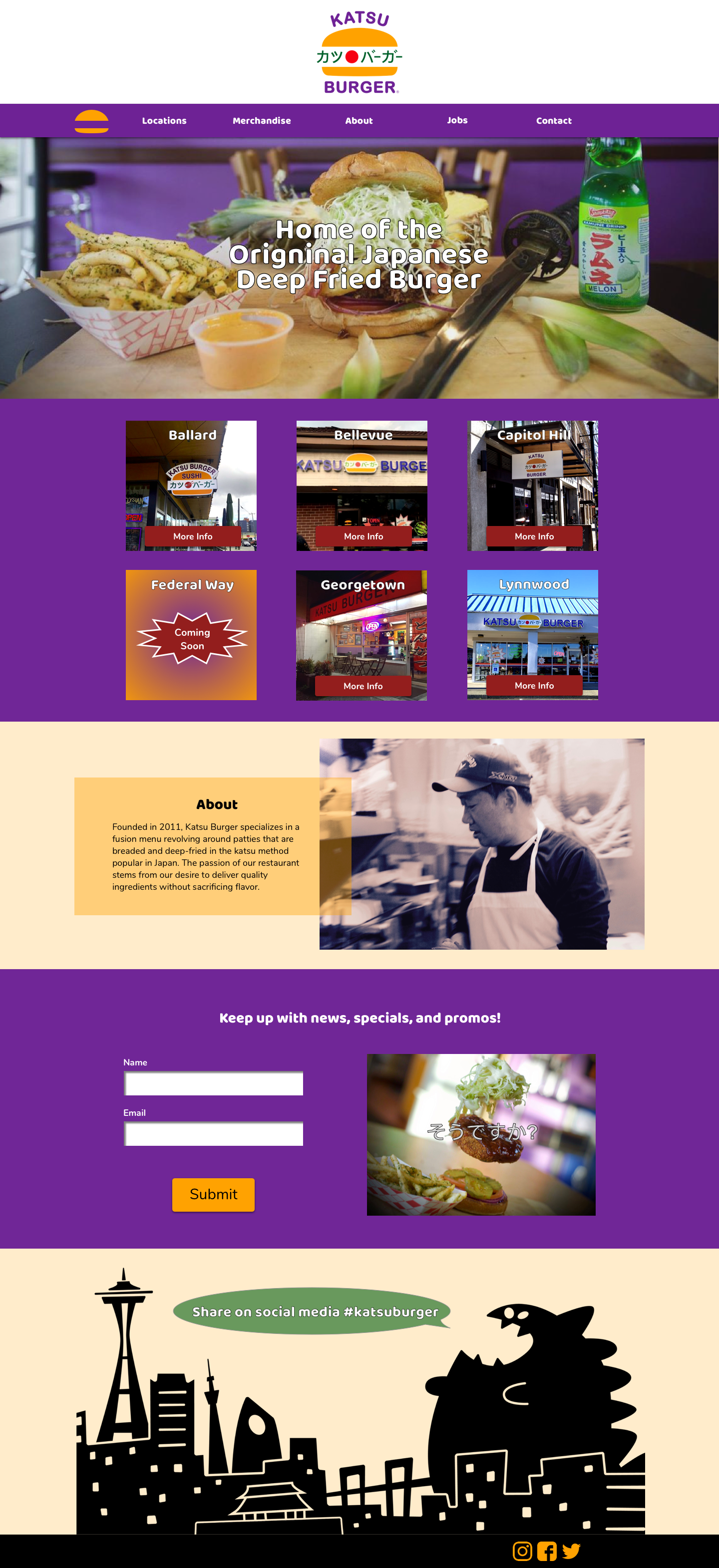
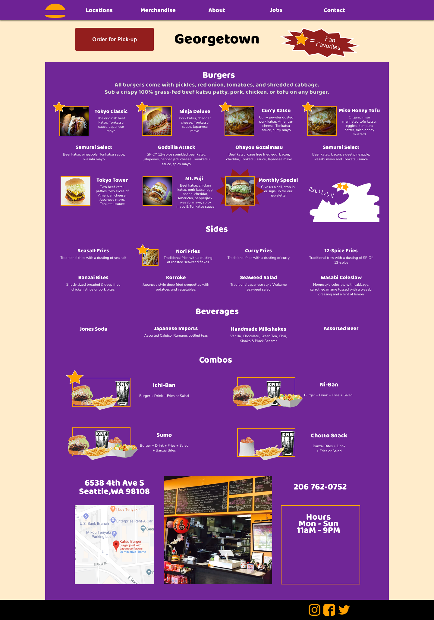

High -Fidelity Mockups
Homepage, Georgetown Page, Merchandise Page
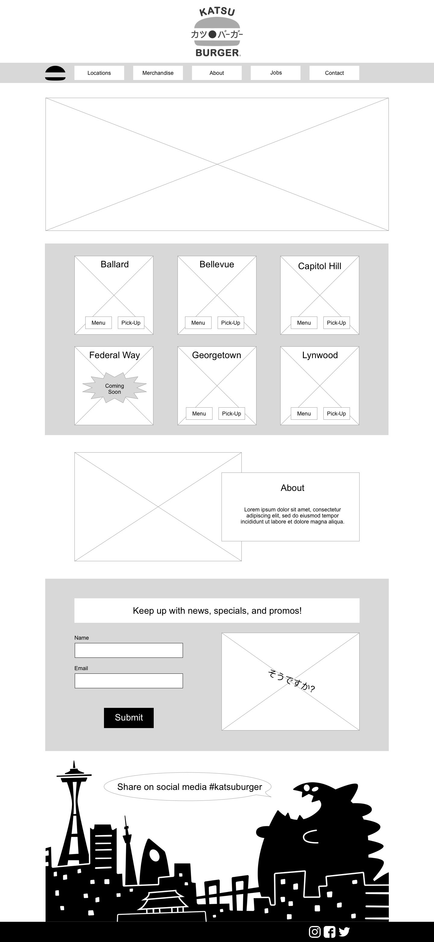
Scrolling Homepage
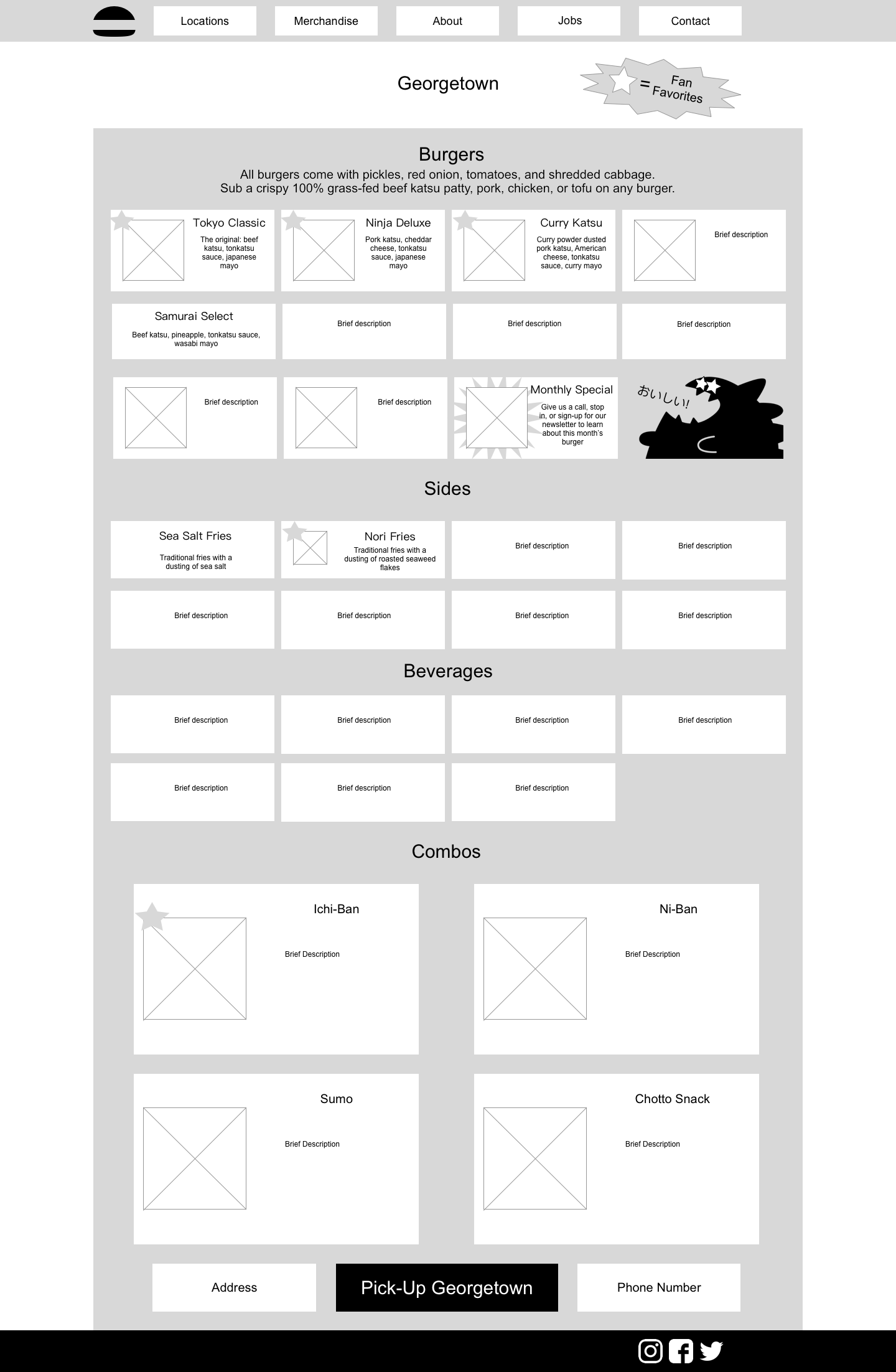
Scrolling Georgetown Page
Lessons Learned
This was an early project in my UX learning experience, so there was a lot of new skills and techniques being picked up and implemented as I worked. I would have liked more time overall. My passion in Visual Design, but there wasn’t enough time to add unique touches considering I had to also complete Research, Wireframing, Prototyping, and User Testing within 2 weeks.
Overall, it was a great exercise in working with an existing product, and it helped that it was a brand that I’m passionate about. If I were to revisit this project I would love to test different color schemes on users because, in my experience, bright bold colors can be off putting, but at the same time, I want Katsu Burger to keep its unique flair. Also, I would love to have a persona based on research rather than being pre-provided because John’s needs don’t line up with what I found in reviews, interviews, or social media interactions.