Costco App
Case study at GA exploring a UX solution for an existing product.
Duration
2 Weeks
Role
Project Manager
Information Architect
Visual Designer
GA Student
Tools
Sketch
InVision
Photoshop
Illustrator
Goal
Design or re-design a mobile app feature as a team and implement a UX project planning process with division of labor.
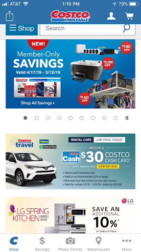
Problem
Costco needs an app that delivers deals, coupons, and rewards as well as membership management to draw more customers to their online store and physical locations. The current app offers too many functions and too much information so that very few people are downloading and engaging with the app.
Hypothesis
By creating an app that is focused on getting the customer the best deal and keeping them up to date on rewards points and current sales, Costco will attract more customers to their online and brick-and-mortar locations. This will prove to be true with an increase in Costco membership sales, more revenue from sales through their stores, and increased customer satisfaction when shopping with Costco.
“[C]onsumers often use brick-and-mortar apps while in stores, so retailers should work to make the experience worth their while by integrating their apps into the shopping experience with exclusive deals and other utilities.”
-Daniel Keyes, Business Insider
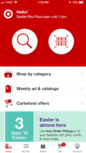
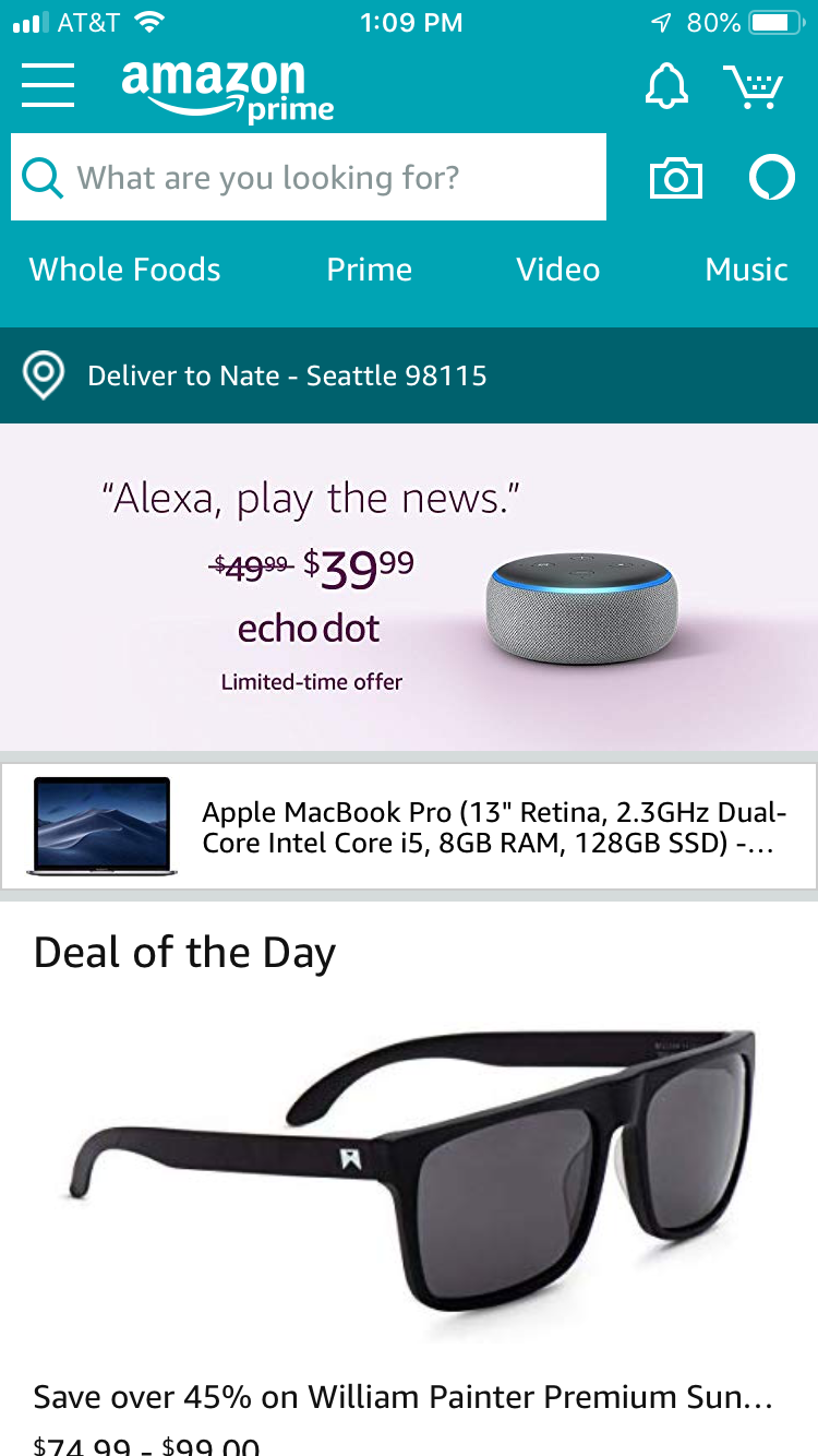
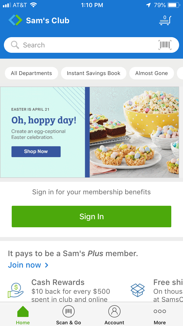
Competitor Analysis
My first step in the Costco re-design was to conduct a Visual Competitor Analysis. Market analysts repeatedly mentioned Target as the best brick-and-mortar app, Amazon as the best ecommerce app, and customers often compared the Costco app to the Sam’s Club app, so this is where I started my research. I compared the apps’ visual hierarchy, visual complexity, and navigation. I was able to identify common design elements and best practices backed up by online user reviews.
Persona
The Smart Spender
Bio: 40-year-old Contract Attorney, married with two young children. She prefers spending time with her family over wasting time shopping for the things they need.
Wants: Get the best deals on household items and be more aware of opportunities to save money
Pain Points: Not being able to easily access coupons on-the-go and complex navigation that make it hard to find information

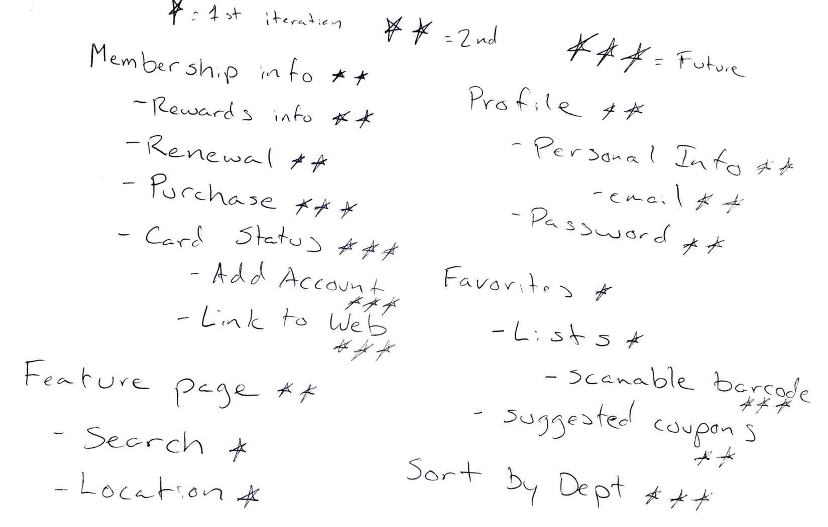
Feature Prioritization
Based on User Survey
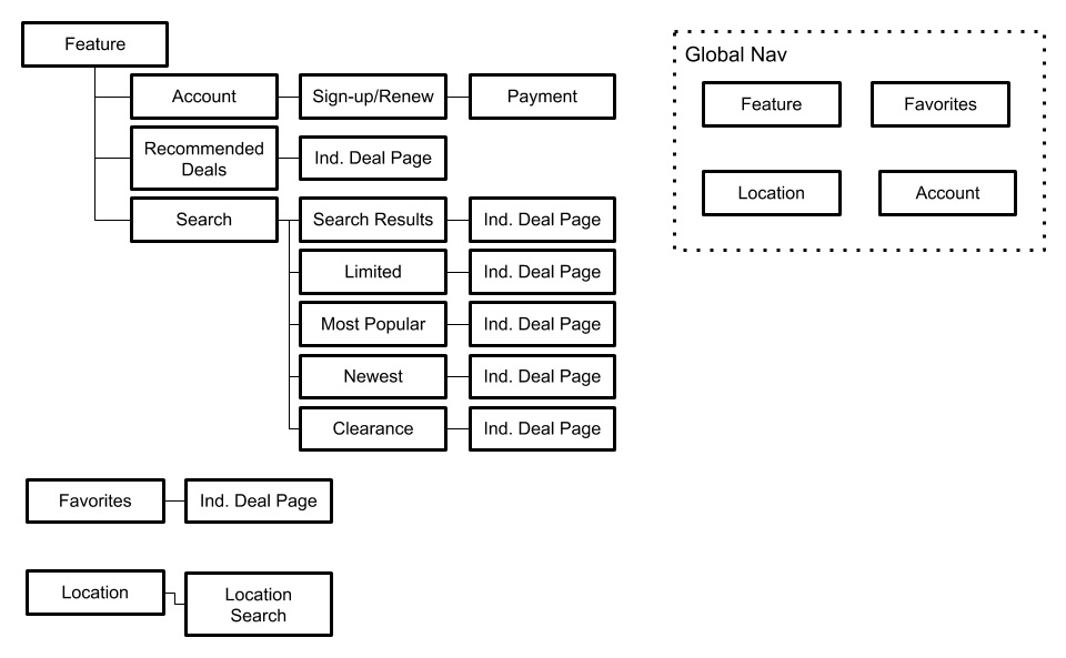
Sitemap
Based on Feature Prioritization and Industry Research
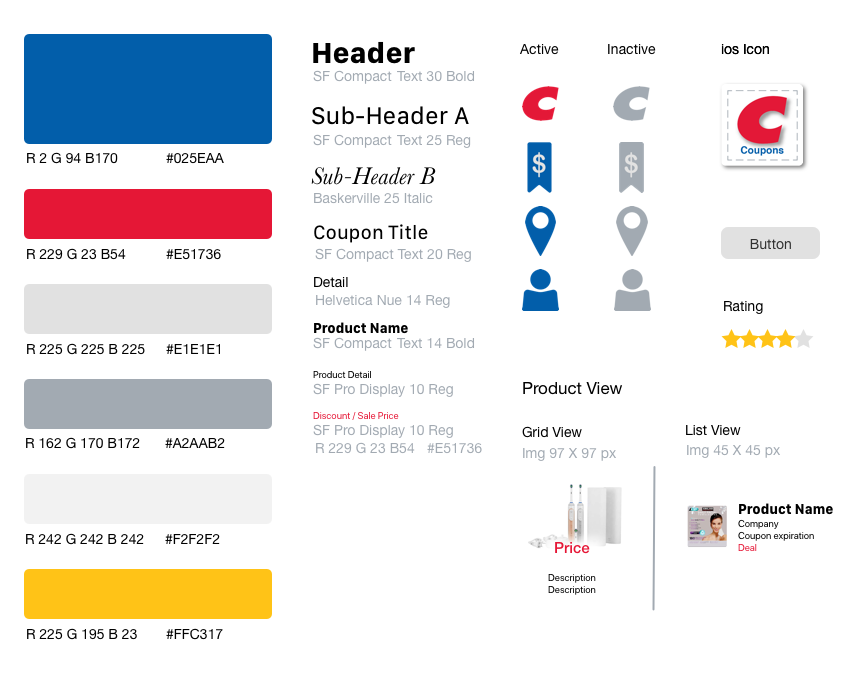
Style Guide
Costco’s Style Guide wasn’t available to me, so I created one based on their logo, membership card, and website.
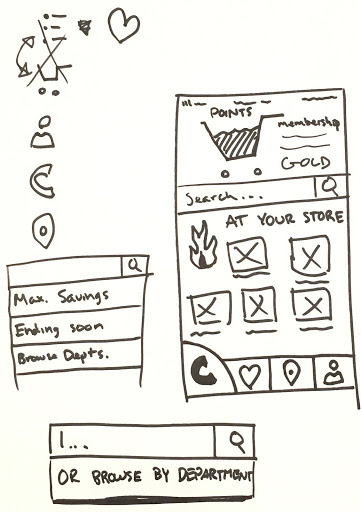
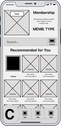
Design Studio > Wireframes
After completing our research our team got together to do a Design Studio exercise, which resulted in a mock-up of our Feature page. Our Interaction Designer turned our sketch into wireframes.
User Testing
After completing the wireframes and turning them into an Interactive Prototype our User Researcher had 4 participants interact with the prototype to complete 3 tasks. She recorded each session and synthesized the results. Most of the tasks were very intuitive to complete, though there were a few points of confusion. I turned the key pages from our wireframes into High Fidelity Mockups in Sketch and made adjustments based on Usability Testing feedback.
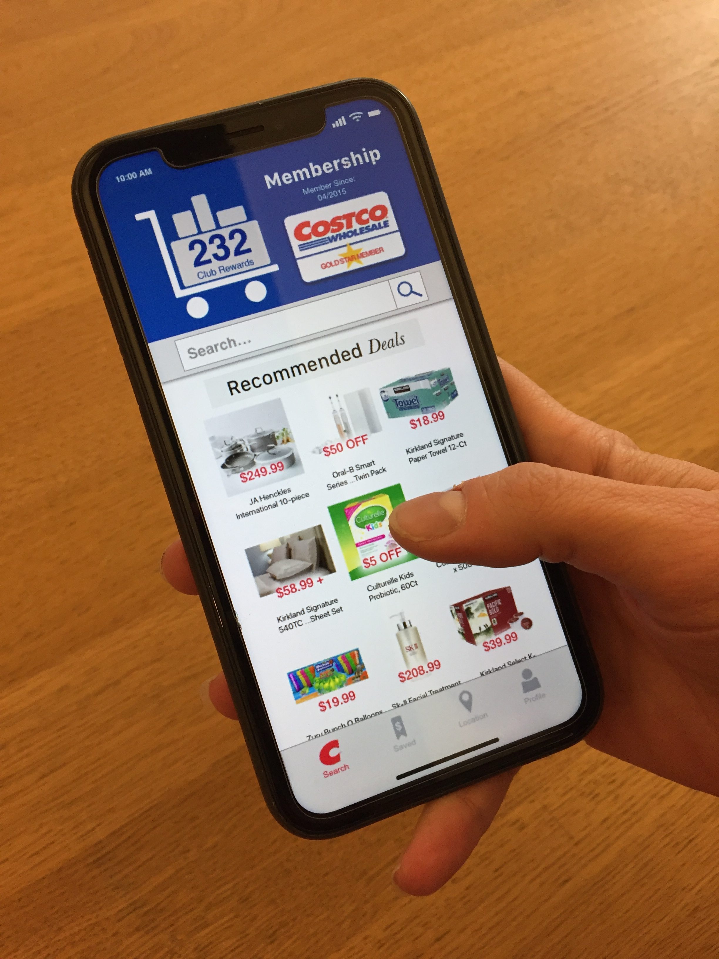
Homepage
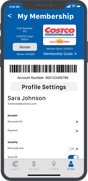
Profile
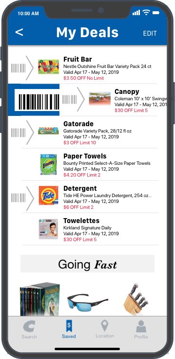
Saved
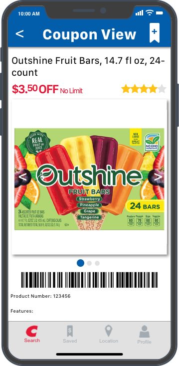
Product Page
Lessons Learned
With only 2 weeks to complete this project, no one on our team had a Costco membership, and we could only find 1 person who had ever used the Costco app. We based a lot of our design on other rewards/savings apps and user interaction patterns. Even with the app downloaded, our project fell between coupon book release periods, so we couldn’t see the actual coupons until 2 days before the presentation due date. I’m incredibly proud of my team for how much research we were able to compile, and it’s a shame we learned after the presentation you only need 1 barcode for the entire coupon book, and you only need to show you have the app to activate the coupons in store.
All in all, this was a fantastic lesson about working on a real world product with a team, and it was an amazing team. Someday I would like to go back and re-model the system, tying the coupons into the membership card, which is scannable though the app in our design.